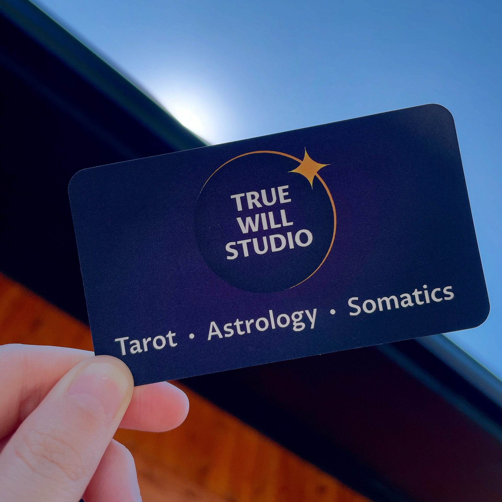
Sometimes I connect with a client who comes into the project with a clear vision and I’m simply there as a conduit through which that vision is executed. When Branwen first approached me, she knew that she wanted an eclipse to play a large role in the visual identity of her business. After talking with her further and learning more about True Will Studio, I knew I wanted to feature some bold grounding colors. Color psychology tells us that purple aligns with the traits of wisdom and spirituality. This made it an obvious choice as the dominant color for the brand. One of the most unique images of a solar eclipse is the moment right before and right after totality when the sun is just peaking out from behind the moon. This moment is called the “diamond effect.” Capturing this moment in the logo and incorporating a golden sunburst gives the logo a nice visual pop without cluttering the icon.


Once we agreed on the main branding, I adapted the logo into various formats that Branwen will be able to use across a variety of platforms going forward.

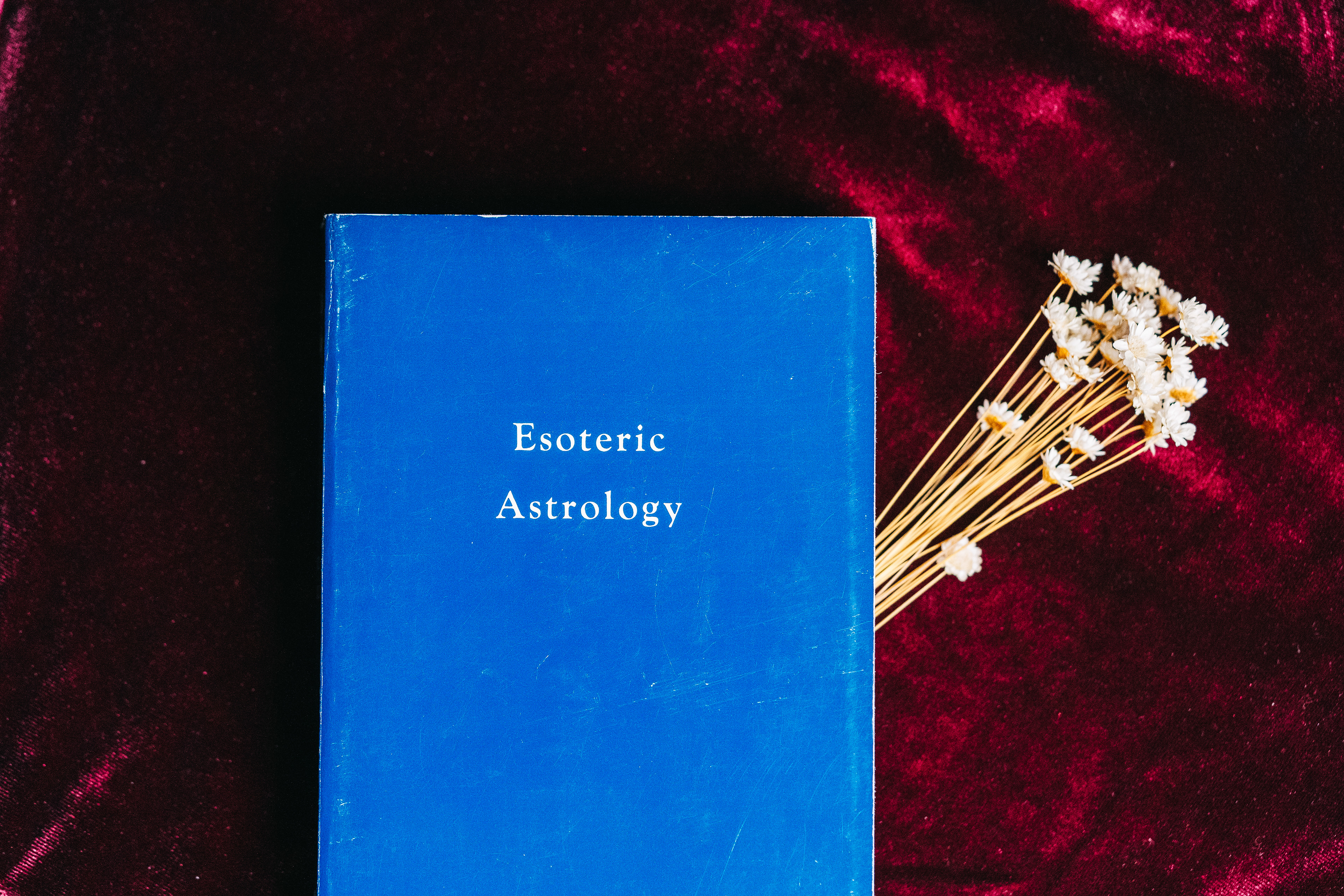
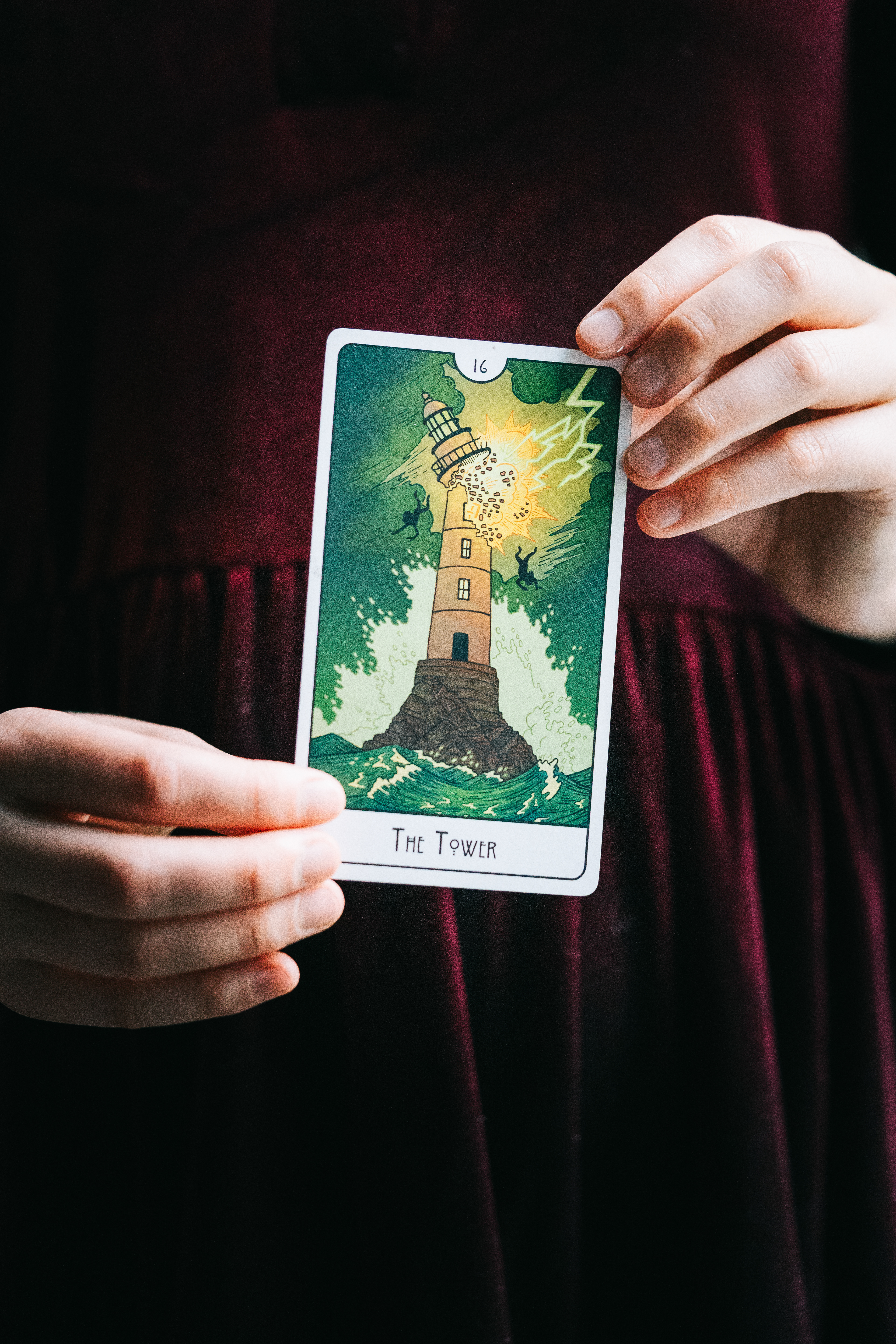
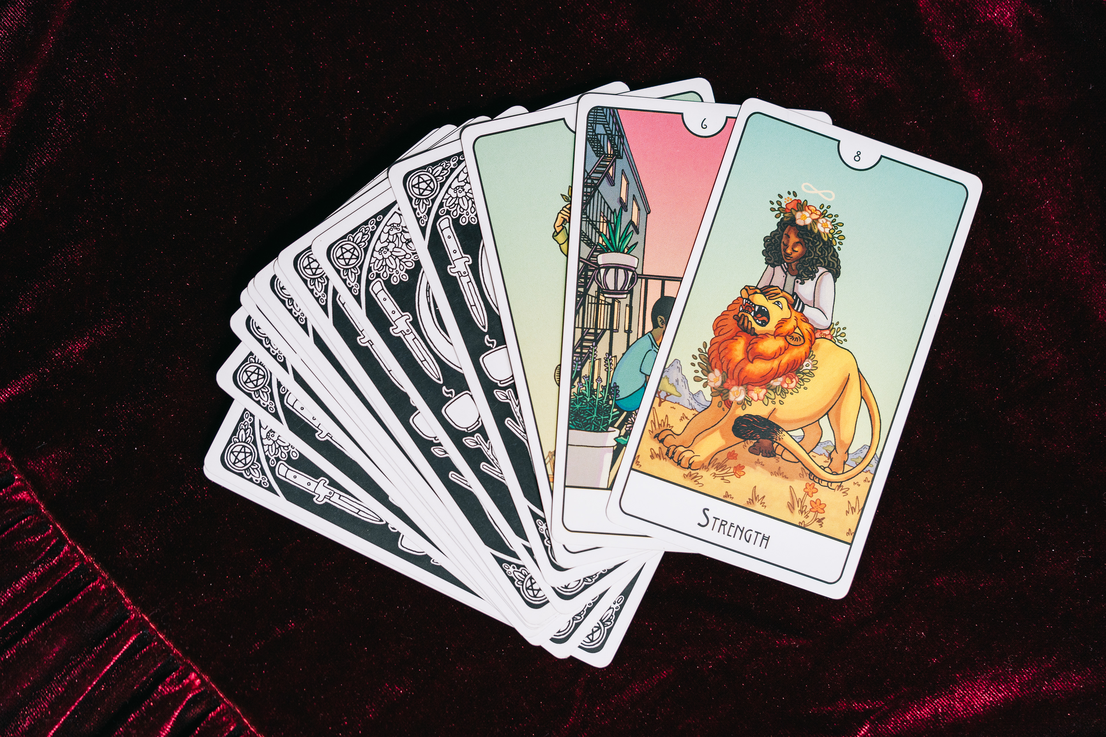
In addition to helping True Will Studio with their branding, I also provided some photography services to help round out their visual identity. More can be seen on my photography website.