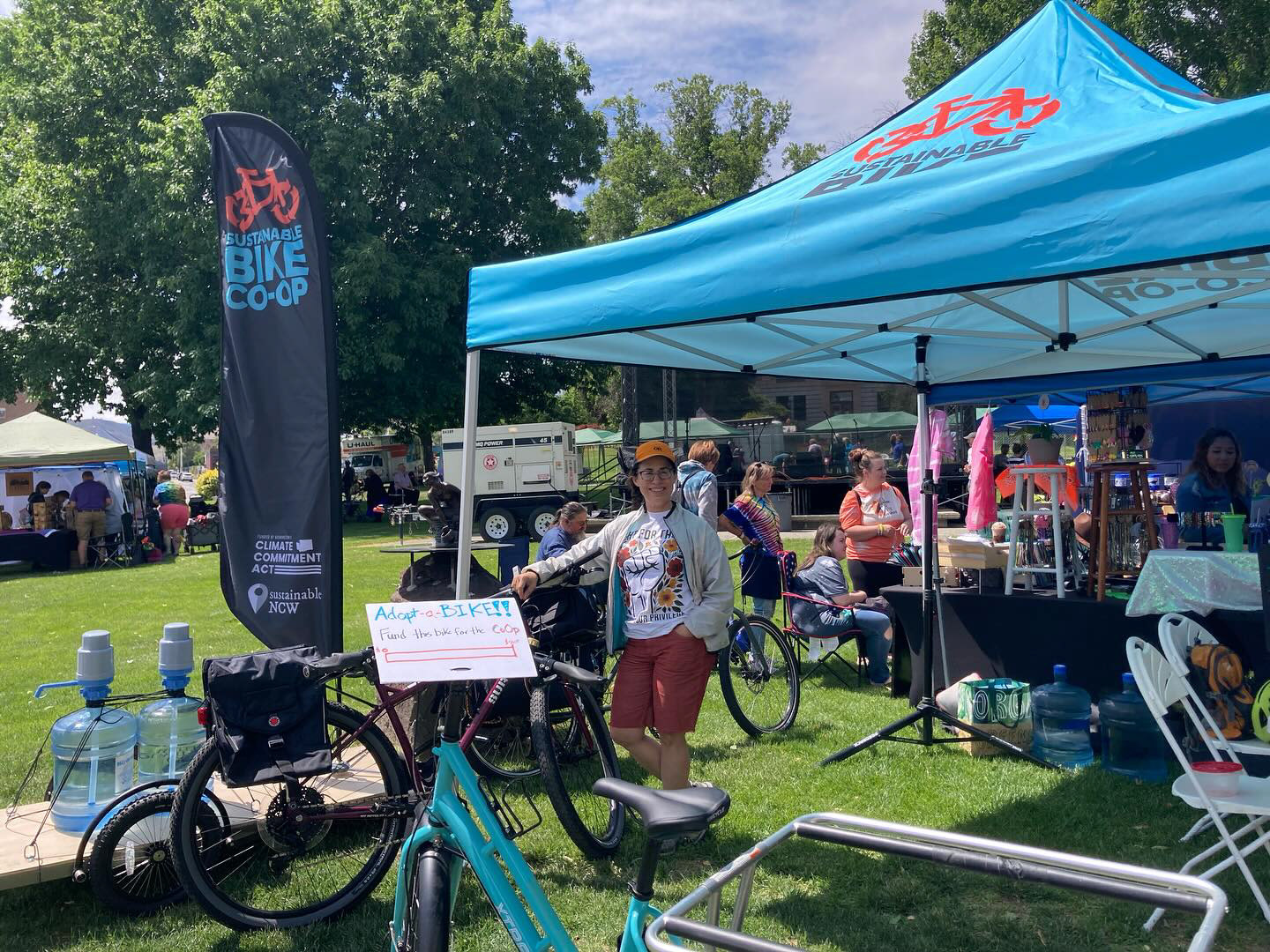
The Sustainable Bike Co-Op (SBC) is a branch of Sustainable NCW. Their goal is to create a safe, inclusive environment where all community members can learn bike repair skills and access tools and work space to grow a thriving bike community in the Wenatchee Valley. They envision a community where bike riding is affordable, accessible, and safe, and where everyone has an opportunity to bike for commuting, recreation and camaraderie.
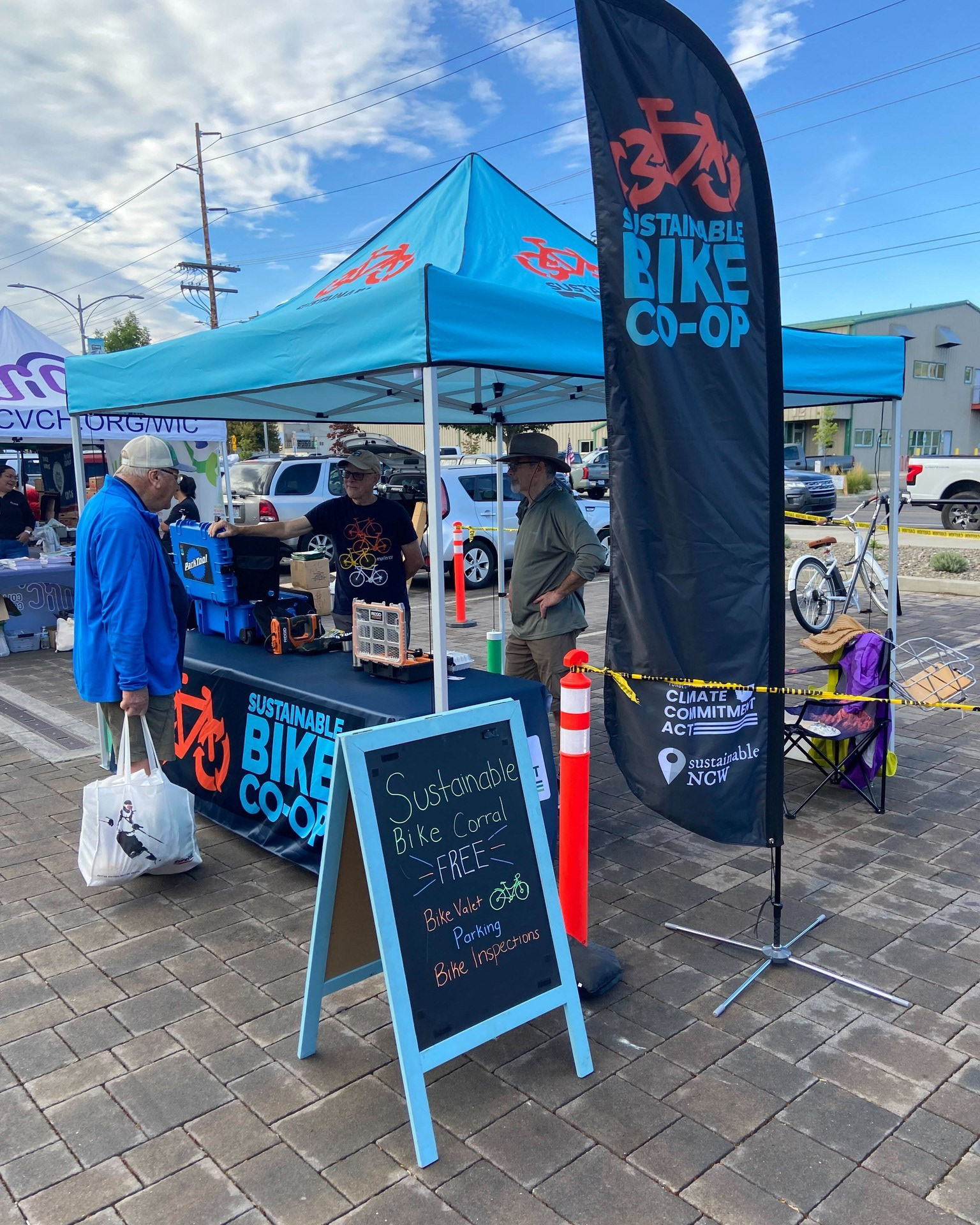
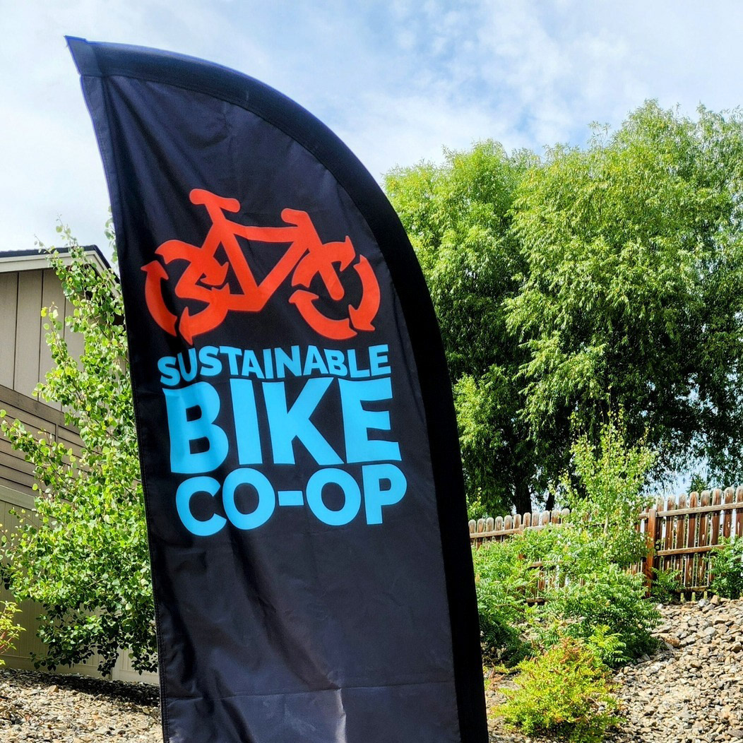
I was lucky enough to hear about SBC when they were first starting out and looking to create a visual identity. As someone who was born and raised in North Central Washington and cycled here for 25+ years, I was eager to get involved. Together with Van Brinkerhoff, Loren Honaas, and input from the leaders of Sustainable NCW, we were able to come up with a logo and branding materials that helped convey the goals of SBC to the community. This branding helped SBC secure grant funding as well as create branded event space materials that are used at community functions throughout the year.
I always like to start designing in black and white. There will always be use cases where a logo can only be used in one color. Therefore, the visual identity of an organization must be identifiable even from a silhouette. A logo can use color to enhance the brand identity, but should never rely on it completely to convey a message.
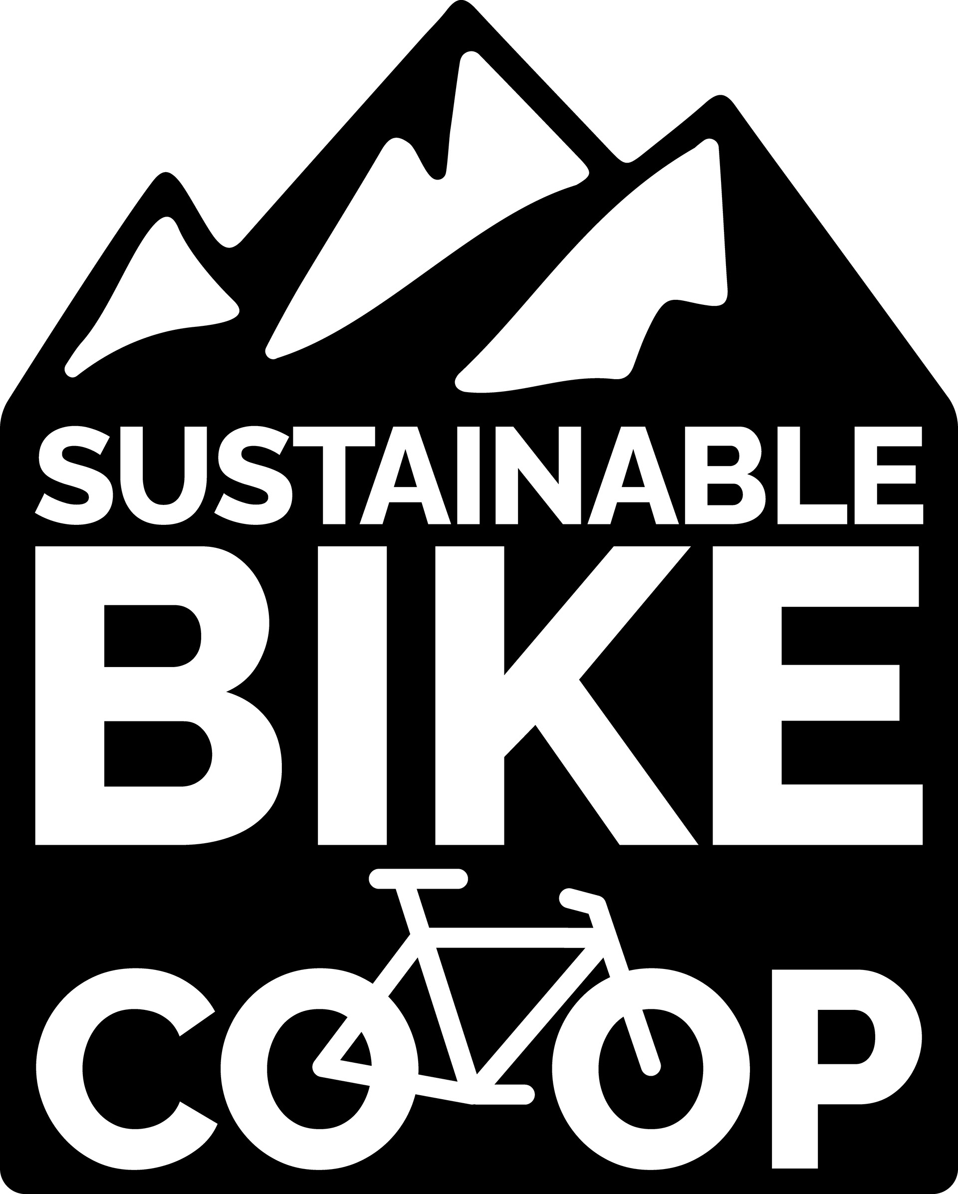
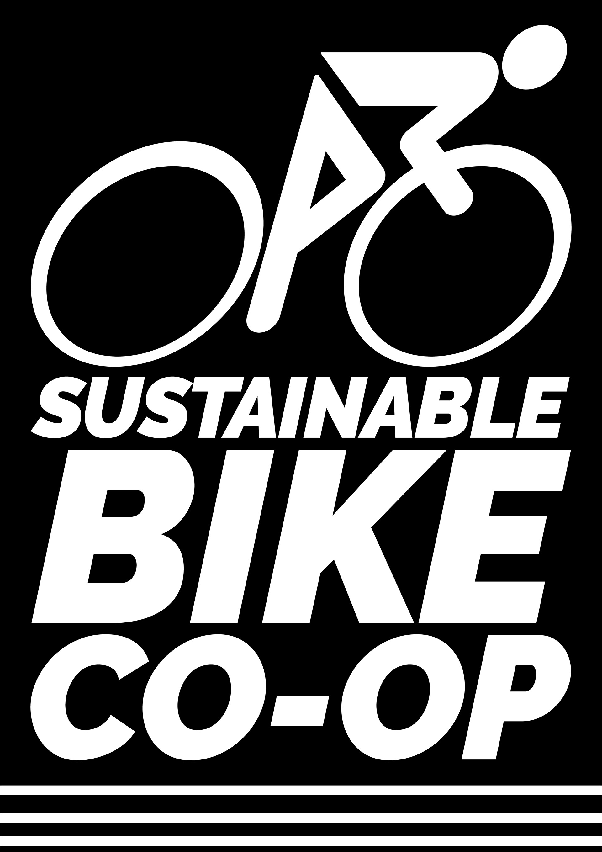
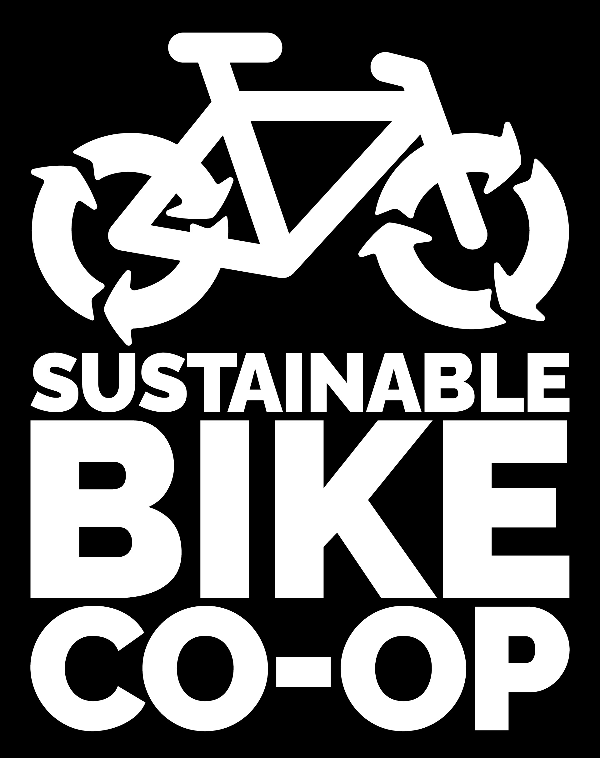
Initially, I approached SBC with three directions for their branding. The first incorporated mountains, which are a prominent feature in North Central Washington, and took advantage of the two “o’s” in Co-Op to serve as wheels on a bicycle. While this was a strong option, the team felt it might lead people to think that the focus was on mountain biking. The second played on the themes often seen in retro skiing logos. Since “Co-Op On The Go” is a big part of SBC, I wanted to create a logo option that had a sense of motion to it. However, for similar reasons to the first logo, the worry was that it had more of a racing feel, which is not a focus of SBC. The final logo we settled on features what I like to call the “re-cycle.” Since sustainability is such a large part of SBC, I decided to morph the highly recognizable iconography for recycling into a bicycle wheel. This icon of the “recycle” strongly conveys the sustainable values that SBC embodies, while also maintaining a bit of forward rolling motion in the logo. Below you can see the three main formats of the final logo in color.
